Change. It’s a word that, as marketers, we’ve developed a love-hate relationship with. It can fill you with excitement or a feeling of absolute dread. It can make or break your success, can be the thing that takes a stagnant and under-performing website and breathes life into it, or that takes something great and for some inexplicable reason drives it into the dust. The best marketers see change as an opportunity, but also understand that the concept of change should be taken with a grain of salt. When your website isn’t converting, it’s tempting to throw up your hands and start over from scratch. Don’t. Although change is often necessary to help turn things around, there are a few key things to remember.
Change should be intentional and strategic.
Don’t make a change just to make a change. Oftentimes marketers get caught up in the pressure to always test, to always be trying something, to always be changing. Although change is an important part of growth, don’t feel like you have to force a change just so you can say you did something different. We’re not saying it’s good to be static, to set your website up and then never touch it again (seriously, this is actually probably the worst thing you can do for your site), but it’s crucial to remember that any change you make to your website should be strategic, serve a purpose, and contribute to accomplishing a specific goal.
For our client, Tampa Bay Reflux Center, the goal was simple: Take a website that had, in the past year, gotten not one single online appointment request and find a way to make it convert.
Change can be small and simple.
“Making a change” doesn’t have to be over-complicated, it’s not always an entire website re-haul or a drastic shift in your messaging. Oftentimes it’s the minute changes, the small, strategic tweaks over time that incite the most powerful results. Perhaps it’s altering your content link color to be less aggressive, or maybe “change” is something as simple as re-positioning the order of items in your navigation bar to draw emphasis to a particular element.
For our client, we enacted the following three, simple changes to the homepage of their website:
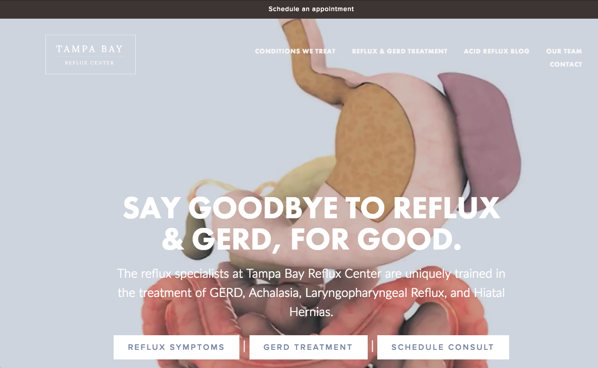
-Removing our “Schedule An Appointment” section from the navigation bar and adding it as a simple announcement bar at the top of the page instead
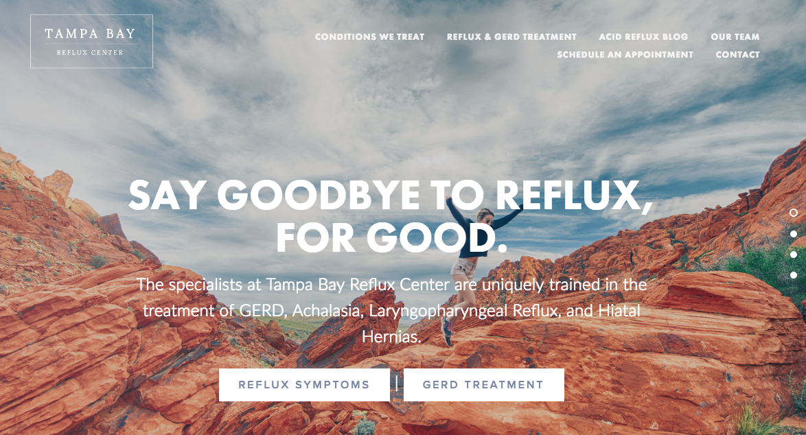
-Changing the images on the home page from lifestyle-related photos to more clinical image content
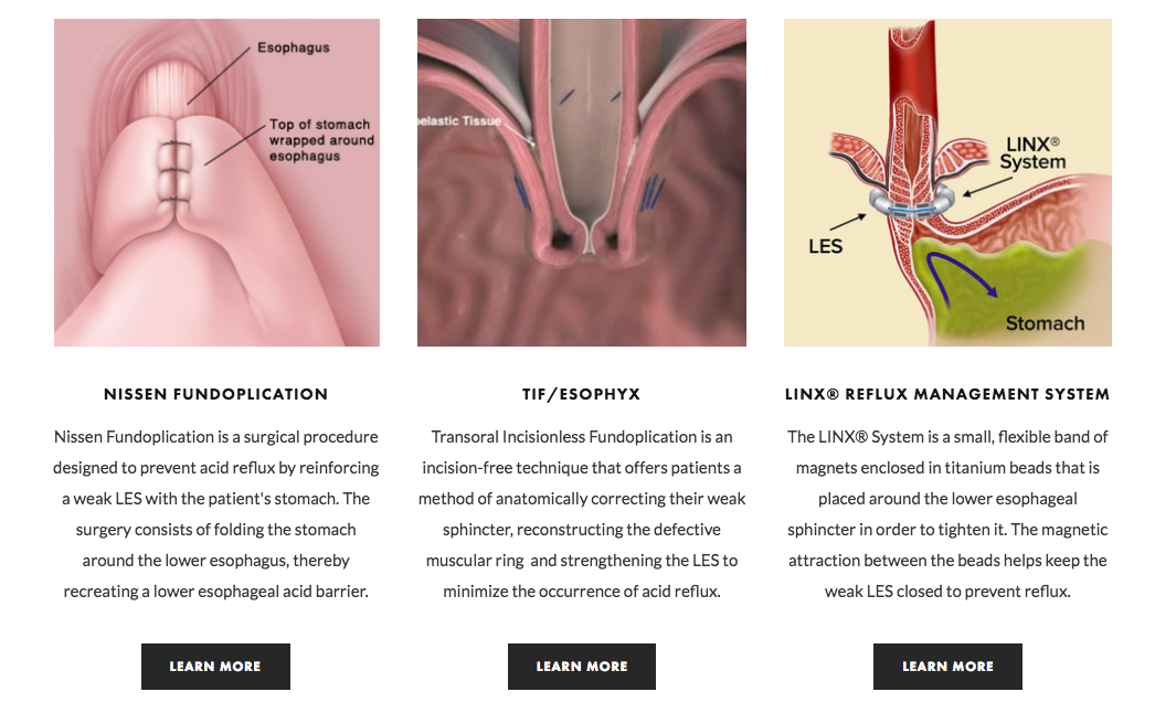
-Re-ordering our homepage content with a more strategic flow
Change can be scary, but the results are incredibly rewarding.
Our changes were small, but the impact was undeniable. Within 3 weeks of making these optimizations to the home page of our client’s site, we had received nine appointment requests through their website, four of which converted into legitimate in-office appointments. That number may not sound earth-shattering, but to a small local client that had received not one single appointment request through the website for a whole year, the impact has been huge.
If it feels like your website has peaked, like it’s failing to perform or has reached its threshold for potential conversions, then it’s definitely time to make a change. Remember to start small, to keep in mind that an under-performing site doesn’t necessarily need a complete re-design to turn things around and convert on a high level. Be strategic, identify an end goal and ensure that any changes you make, regardless of how big or small they will be, work directly towards accomplishing that goal. If you need help, that’s what our marketing experts are here for!
Written By:


